Technical analysis refers to the practice of studying charts to identify price patterns and trends that can help a trader make informed decisions. Forex trading is no different than trading stocks, bonds, or other financial instruments. At the same time, technical analysis plays an essential role in a forex trader’s decision-making.
No forex trader can survive without a basic understanding of forex trading charts. This article will discuss the top three trading charts that can help you profit from the movements in the forex.
How to analyze technical charts?
Markets usually move in three predictable patterns:
- upwards
- downwards
- range
Charts allow us to identify these price movements and help us in making better buying or selling decisions.
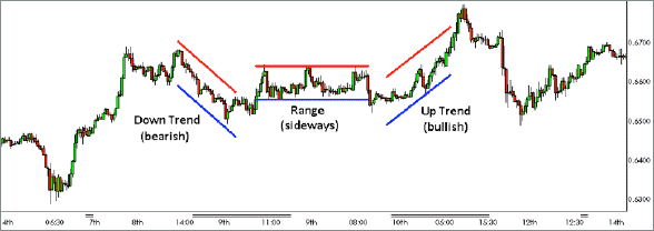
The chart above captures all three types of price movements as one can see the downtrend or bearish trend, range or sideways movement, and the uptrend or bullish movement in the price.
As visible, any downward movement of the price that takes place over time is a sign of a bearish trend that will lower price over time. While an upward movement in price with price constantly increasing is known as the bullish trend. It means that the price can still go upwards.
When there is neither a bearish/bullish trend, it is known as the price of a currency is in a range. In other words, it is trading sideways where the price remains in a narrow or broad range for an extended period.
There are different types of charts for studying the price movements in the forex market. Each type of chart has its advantages and disadvantages and may be better suited for a specific situation.
We will now discuss three types of charts that are the most useful ones for forex traders.
Candlestick charts
There are among the most used charts in forex trading, and you have perhaps already come across this type of chart during your trading career.
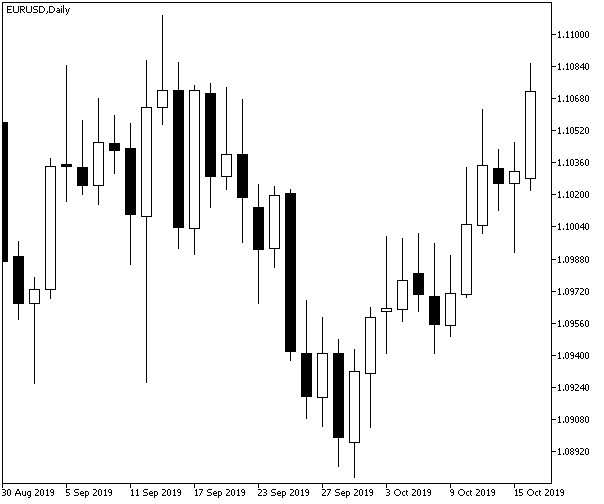
The above candlestick chart shows the price movements in the EUR/USD currency pair between 30 August 2019 and 15 October 2019. Let’s consider each element of this type of chart.
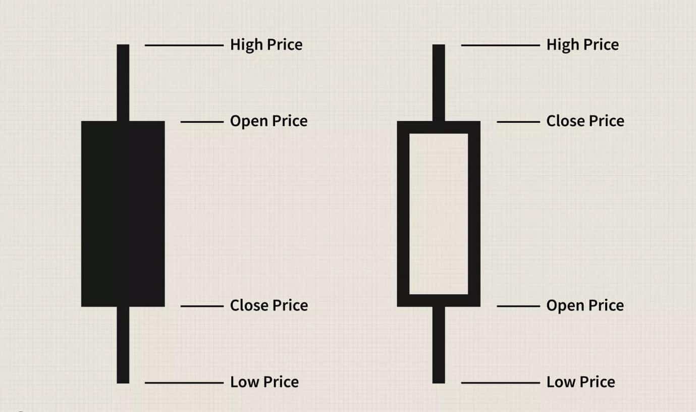
A candlestick chart comprises several individual lines that resemble a candle with the actual body, upper shadow, and lower shadow:
- The top end of the upper shadow represents the high price for a day.
- The top end of the actual body means the open price, while the lower end of the body shows the closing price.
- The lower shadow represents the low price for a day.
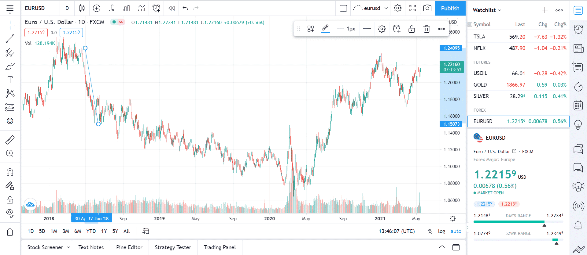
The blue line in the above bar chart of the EUR/USD currency pair shows the downward price trend or bearish trend from 27 April 2018 until 12 June 2018, when EUR/USD crashed from 1.24050 to 1.14937.
Another chart of the same currency pair showed the bullish trend when the price moved upward over several weeks.
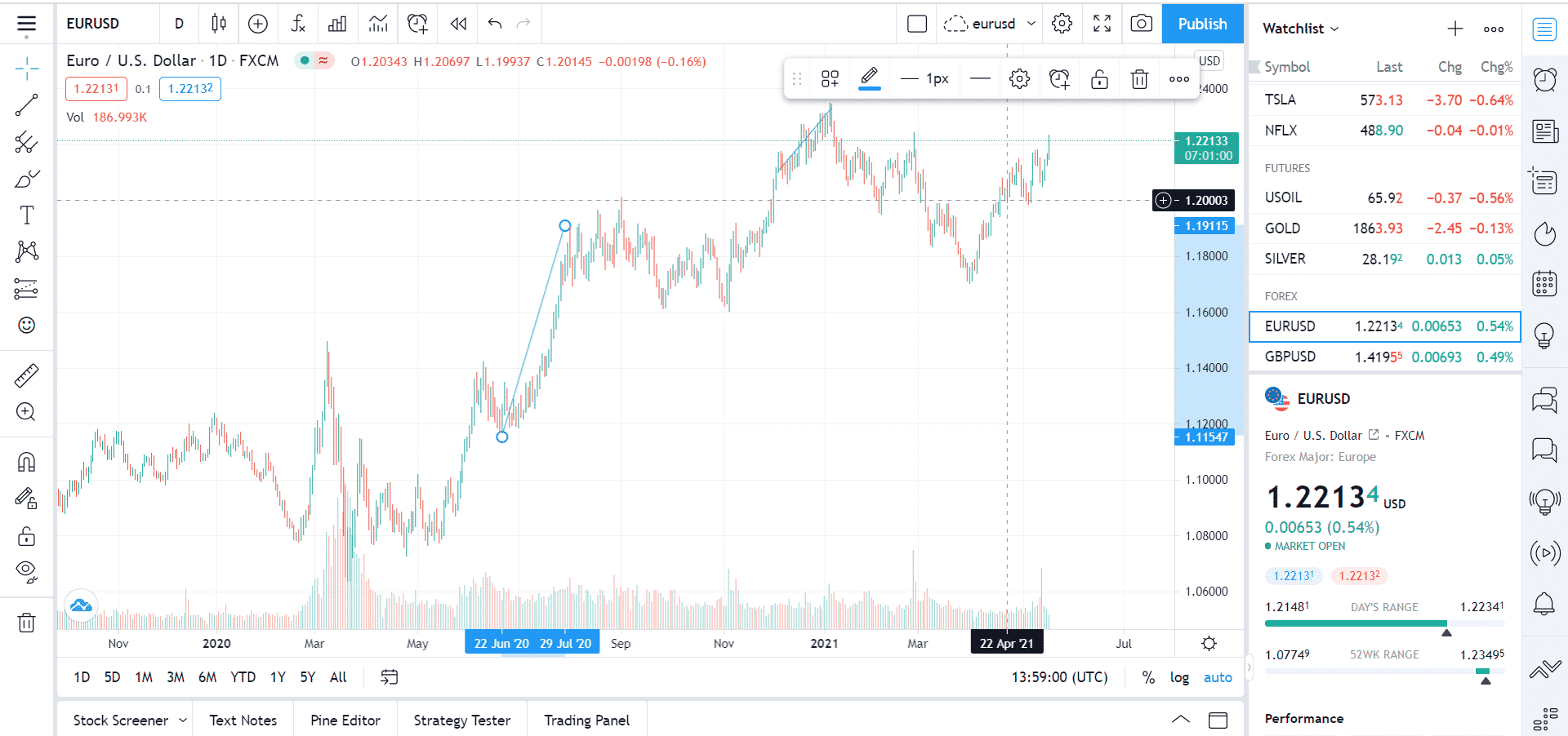
So the price of EUR/USD moved from 1.11 to 1.19 between 22 June 2020 till 29 July 2020. The blue line shown in the chart traces this bullish trend.
Candlestick charts do an excellent job of displaying all relevant information in a visually appealing way. As a result, they are the preferred choice of millions of traders due to their ease and simplicity. However, there is also a disadvantage of an overabundance of information associated with candlestick charts. They may not help someone who wants to identify a clear bullish or bearish trend in the prices.
Bar charts
Bar charts are another popular type of chart used by forex traders to identify patterns and trends.
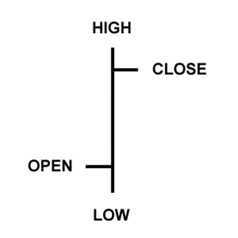
The above bar represents open, high, low, and close or OHLC prices for a currency, stock, or other financial instruments. A bar chart is composed of several of these bars placed next to each other.
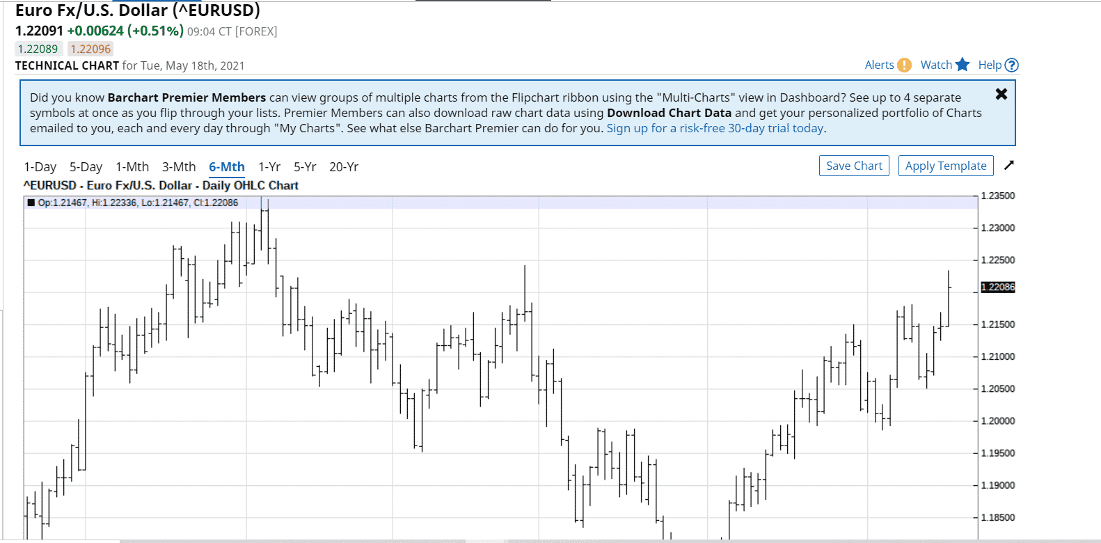
Here is an example of a bullish trend in EUR/USD shown using a bar chart.
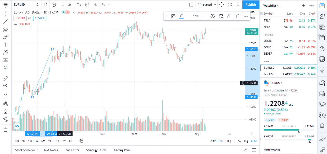
It traces the price movement from 22 June 2020 till 29 July 2020, as shown in the above candlestick chart.
You can see the difference between these different types of charts. Here is another bearish trend as displayed using bar charts.
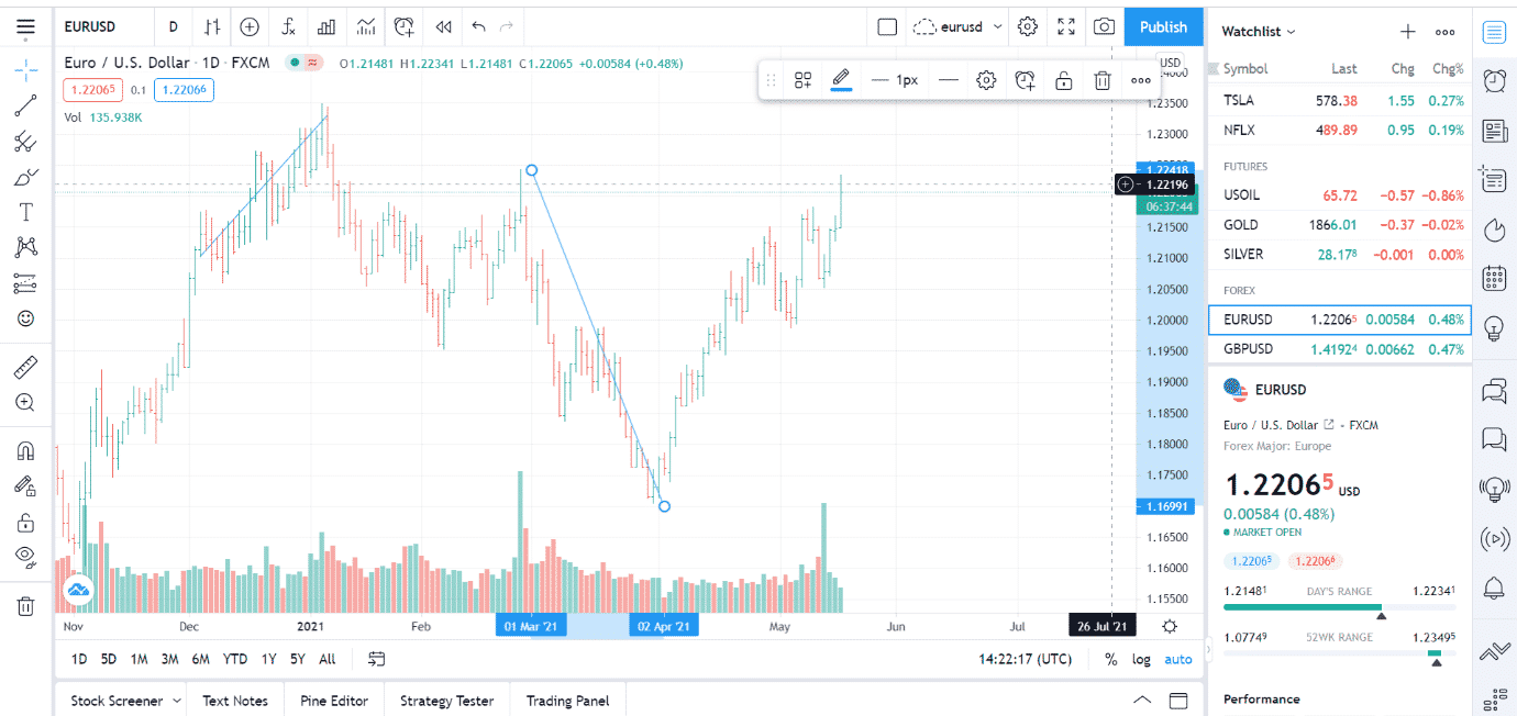
The above bar chart displays the downward movement or bearish trend of EUR/USD from 1.22387 to 1.16975 between 1 March 2021 and 2 April 2021.
Bar charts are best for traders who want access to complete information about the prices they display, such as open, high, low, and close of a currency pair. Although, there is also a slight disadvantage of using bar charts as these charts are visually less convenient for determining whether an asset’s value has increased or decreased over time.
Heikin Ashi charts
Heiken Ashi is a form of a chart that is quite closely related to candlestick and looks similar to usual candlesticks. Heikin Ashi is a Japanese term where Heiken means average, and Ashi means pace, so Heikin Ashi means an average rate of price or the average change in price.
Let’s look at the Heikin Ashi chart.
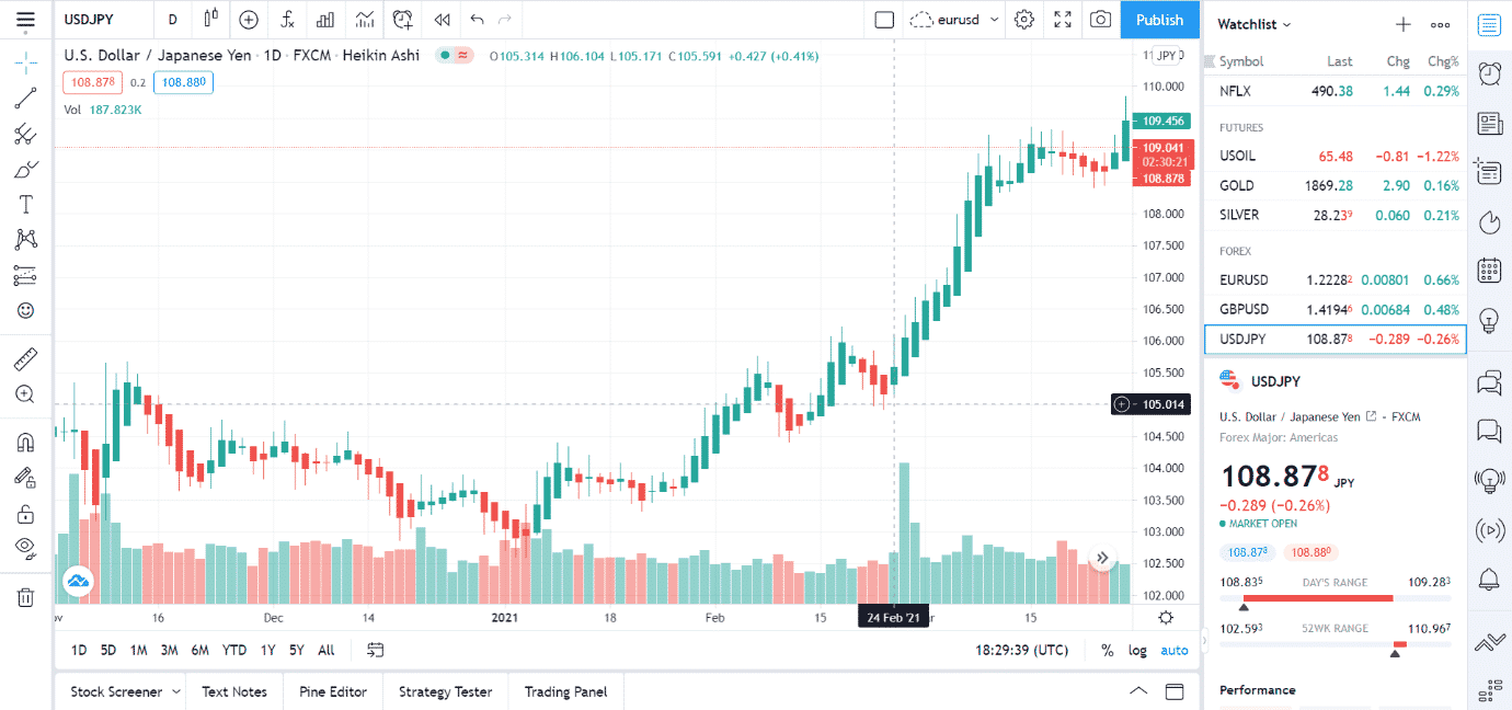
As you can see from the above image, it involves continuous green and red bars as it is calculated using the average rate of change. Therefore, Heikin Ashi is best suited for traders who want to identify a clear trend in prices as it can show price trends compared to other charts.
Here is a chart showing a bullish trend using Heikin Ashi charts.
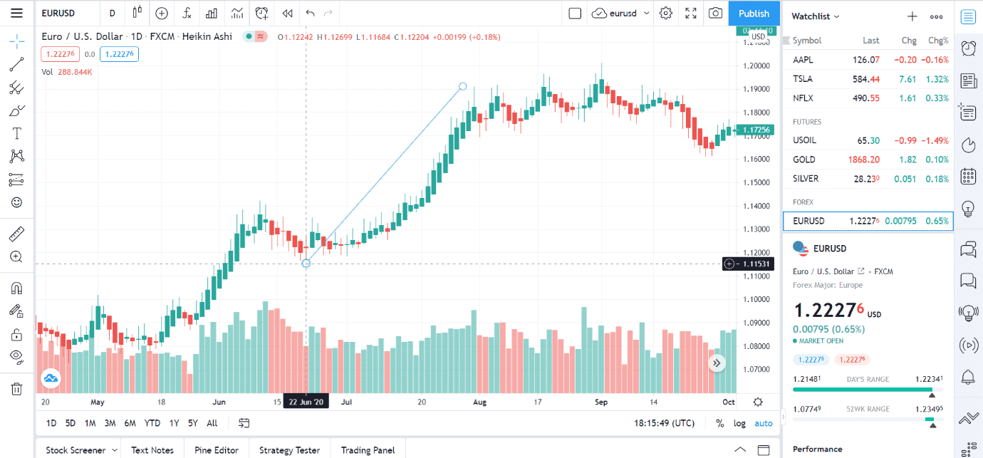
As you can see, the green candles that are placed next to each other do a much better job of clearly showing the upward or bullish trend. The blue line traces this bullish trend. Now let us look at another chart, this time showing a bearish trend using Heikin Ashi charts.
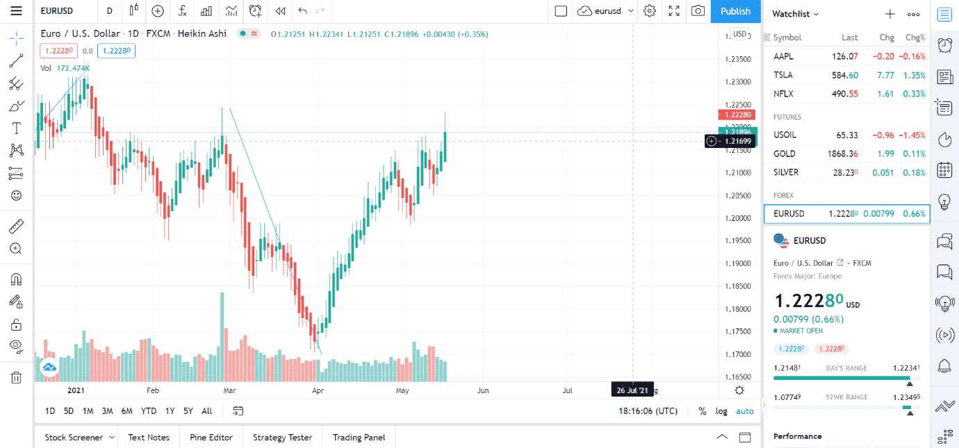
The image above shows the bearish trend as is visible from the consistent pattern of red candles that allow one to see the extent of downward movement in the price of EUR/USD.
The Heikin Ashi charts perform better than others to show the trends in prices clearly. Therefore, they are best for trades based on patterns where a trader wants to take advantage of a bullish or bearish trend.
