There are many types of classical chart patterns around. There is a good chance you know some or most of them. Besides, they are the easiest to learn when someone is new to trading. Learning about them can be fun as some of them are familiar structures in real life.
Here is a list of the classical chart patterns used by traders:
- Double tops & double bottoms
- Rising wedge & falling wedge
- Symmetrical triangle
- Descending & ascending triangles
- Descending & ascending channels
- Flag
- Pennant
- Rectangle
- Classic and inverse head & shoulders
- Megaphone
- Diamond
Learning how to trade these patterns will prove helpful if you want to master price action trading. In this article, we have identified the three best patterns with the highest probability of success. This is not to say the other ones are not effective, though. The thing is that these three patterns give clear signals, so you know what to expect when one arises.
Top three best classical chart patterns
While many classical patterns work, not all of them are effective in terms of success rate. If you have been trading for a while, you might have a different set of successful chart patterns.
We believe three of them produce high probability trade setups:
- Rising and falling wedges
- Ascending and descending triangles
- Head-and-shoulders setup
№1. Wedge
It often occurs in any symbol and any time frame. However, it typically forms at the end of a trend, marking essential reversals. Others say price may break the wedge pattern in any direction, and you can trade it both ways. However, in most cases, this pattern is a precursor of explosive moves against the trend and often stamps the end of a trend.
You might find it hard to identify this pattern if you are a beginner. This is because it creates a series of higher high and higher lows for an uptrend and lower high and lower lows for a downtrend.
With the use of trend lines, you can detect the sentiment shift as the price moves forward. Seasoned traders might not need the trend lines to determine the wedge pattern. Instead, a trained eye allows one to spot the pattern as it forms on the chart.

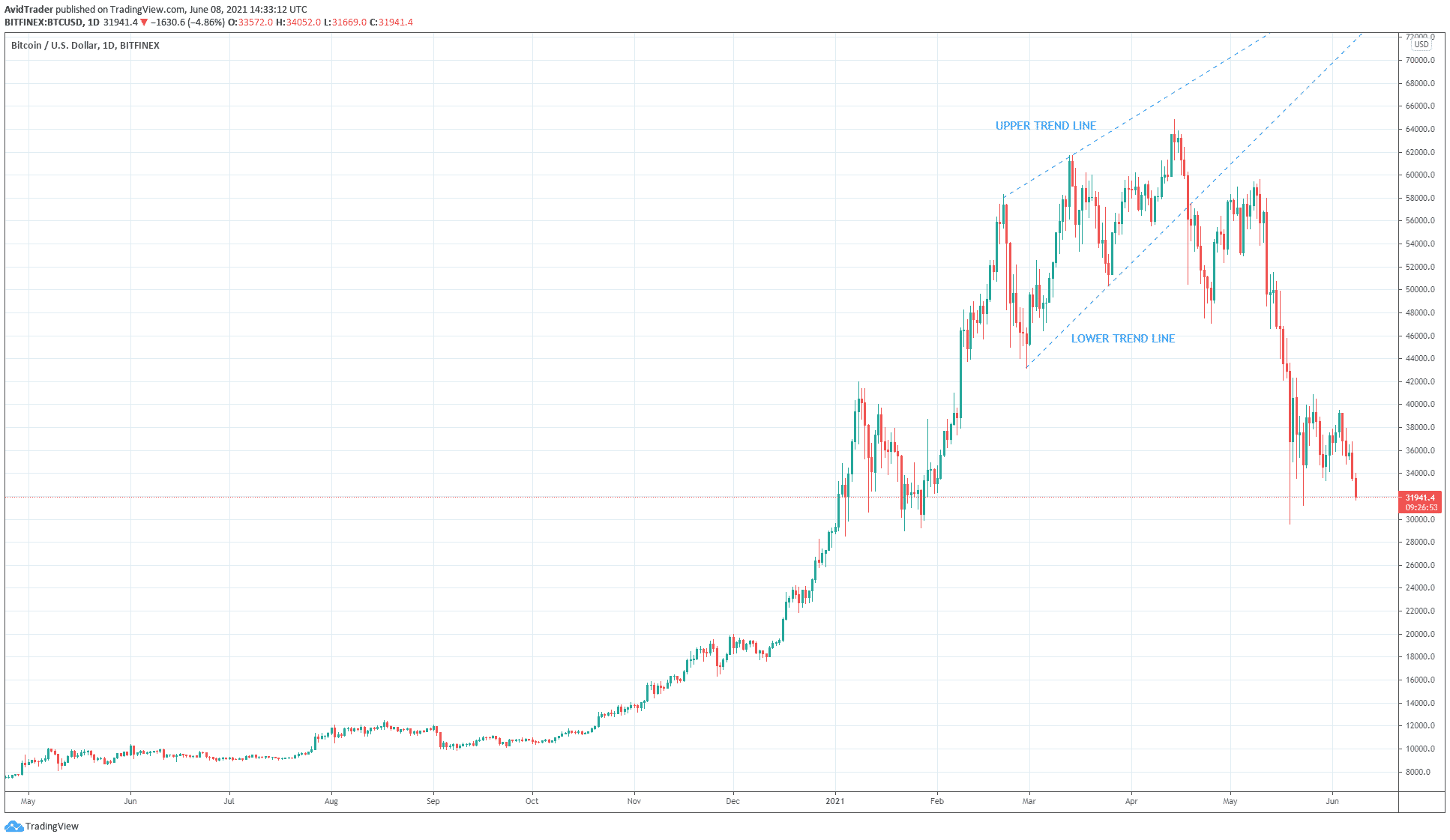
Look at the daily chart of BTC above. This is a classic example of a rising wedge — a bearish pattern, while a falling wedge is a bullish pattern.
- It is formed at the top of the bullish trend.
- It presaged the current downtrend.
- At the time of this writing (8 June 2021), the price is hovering around $31,000.
- It is a 50% drop from the recent high of $64,829 on 14 April 2021.
To detect a rising or falling wedge:
- Use one trend line connecting the swing lows
- And another trend line connecting the swing highs
Remember, you need at least two points only to draw a trend line. When the upper and lower trend lines are converging, then you see a wedge pattern. Review the above chart.
№2. Ascending/descending triangle
Compared to the symmetrical triangles, the ascending/descending triangles have a clear directional bias. That is why when you see such a pattern, you already know which direction price would go next, pending a breakout. While the success rate is not 100 percent, it is pretty high. When it fails, you have to get out quickly. That means the price is doing something unusual.
- The descending triangle often forms within the context of a downtrend
- Meanwhile, the ascending triangle occurs in a bullish market
These are the market conditions where these patterns seem to work well. However, when they appear in other market scenarios, the resulting setups usually are not as effective.

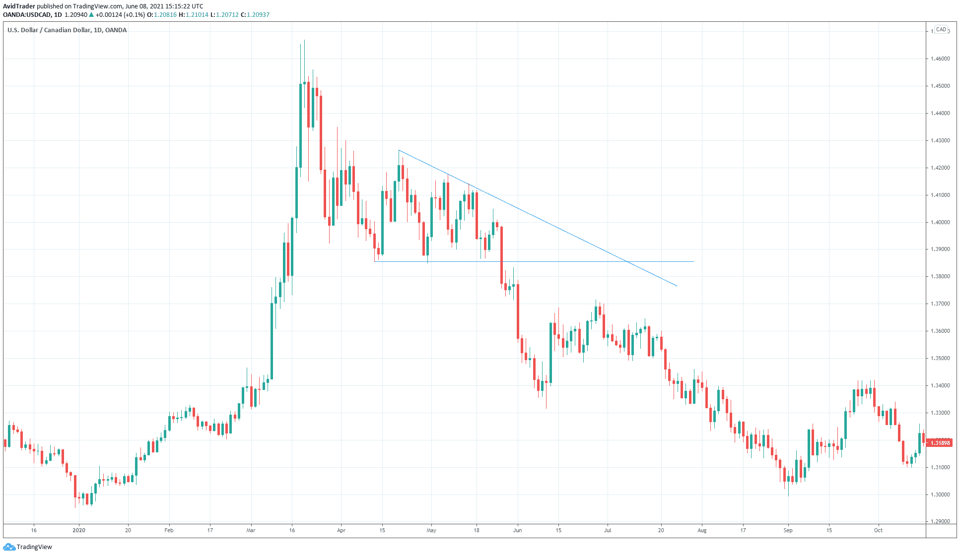
Consider the descending triangle in the above USD/CAD daily chart.
The market situation is just right for the formation of this pattern. This is because the pattern came about after the market made a peak and started going down. You can say the asset was consolidating at this point and was looking for direction. It found a direction when it broke the base of the descending triangle.
- As you can see in this example, the price made lower highs but did not make lower lows.
- This only shows that price was not strong enough to break the support, which acted as the triangle base.
- Instead, the price continued to gather strength until it finally broke support with a big red candle.
- Typically, the price should break out from 30 to 70 percent of the base.
Longer than this, the descending triangle setup loses efficacy.
№3. Head-and-shoulders pattern

It occurs frequently, and you can easily find one when it forms. This is because it requires a lot of candles to complete the pattern. More often, it is big enough that it looks obvious on the chart.
This pattern is a reversal setup, and it has two variants:
- The classic one is a bearish setup that occurs at the tip of an uptrend.
- On the other hand, the inverse head & shoulders pattern is a bullish setup that forms at the tip of a downtrend.
That is why it is easy to trade this setup because the trade direction is clearly defined. Not only that but the entry criterion is also fully established. Subjectivity is left out, so you can trade with confidence.
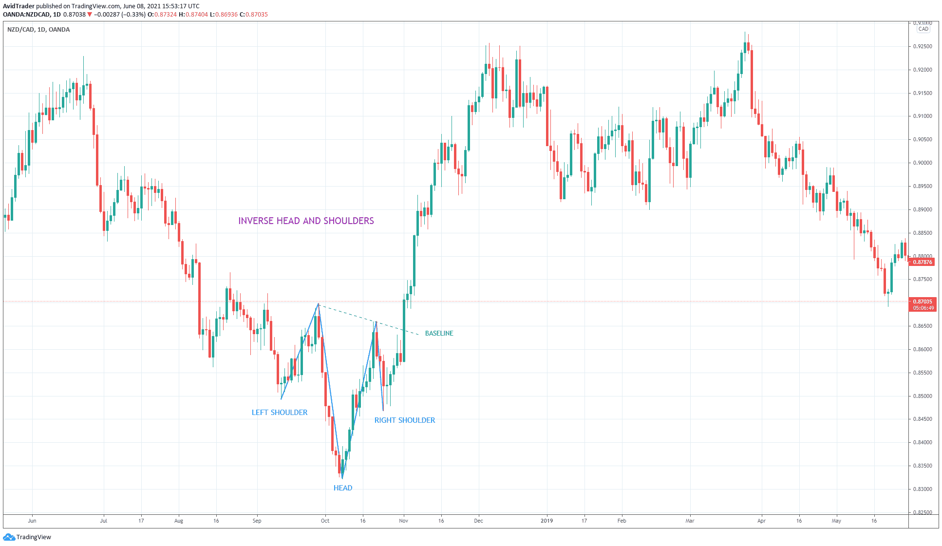
Let us use the chart above to illustrate when to open the trade.
- The above chart is a daily chart of NZD/CAD.
- Since the pattern forms in a downtrend, the head-and-shoulders pattern is of the inverse variant.
- An ideal pattern is the right and left shoulders at the same level and the baseline in a horizontal position.
In this example, the two shoulders are not fully aligned, and the baseline is inclined to the downside. However, this setback is not critical. The setup is still ideal. Since the market is not perfect, this setup is nonetheless tradable. If you take this trade setup, the entry would have come when a big bullish candle broke the baseline. Then you could have set your stop loss a little below the right shoulder.
Final thoughts
The above examples show how powerful these patterns are. However, you have seen only three such examples here. You can find more when you scan your charts. So what you should do is build a chart library on these themes. That is an excellent way to make knowledge on efficient trading.


