Market exhaustion is an event wherein price loses momentum as it moves in any direction. When the market is in this situation, traders can capitalize on it by fading the move, expecting the price to move the other way, either against the trend or along with it.
Exhaustion is a relative term depending on how you look at it. For example, to judge if the price movement is losing momentum, you can use technical indicators such as relative strength index, stochastic, momentum, and others.
However, you do not need any of these tools to make such a judgment call. What you need is your eyes and a good amount of screen time.
Three clues that indicate market exhaustion
This article presents three scenarios that will give you a clue if a market is already exhausted and is ready to turn around. You might not find content similar to this one elsewhere online as the following discussions are novel ideas by the author. These three scenarios occur very often and abound in the markets, but not many traders talk about them. Once you grasp the concepts presented later, you will get a fresh perspective of the markets.

Clue №1: Turnaround motion
It is possible to gauge market strength by reading price action. You can quickly tell if market momentum is still there or is waning just by following the candlesticks as they form on the charts. One way to determine if the price is losing steam is to make a turnaround or parabolic motion.
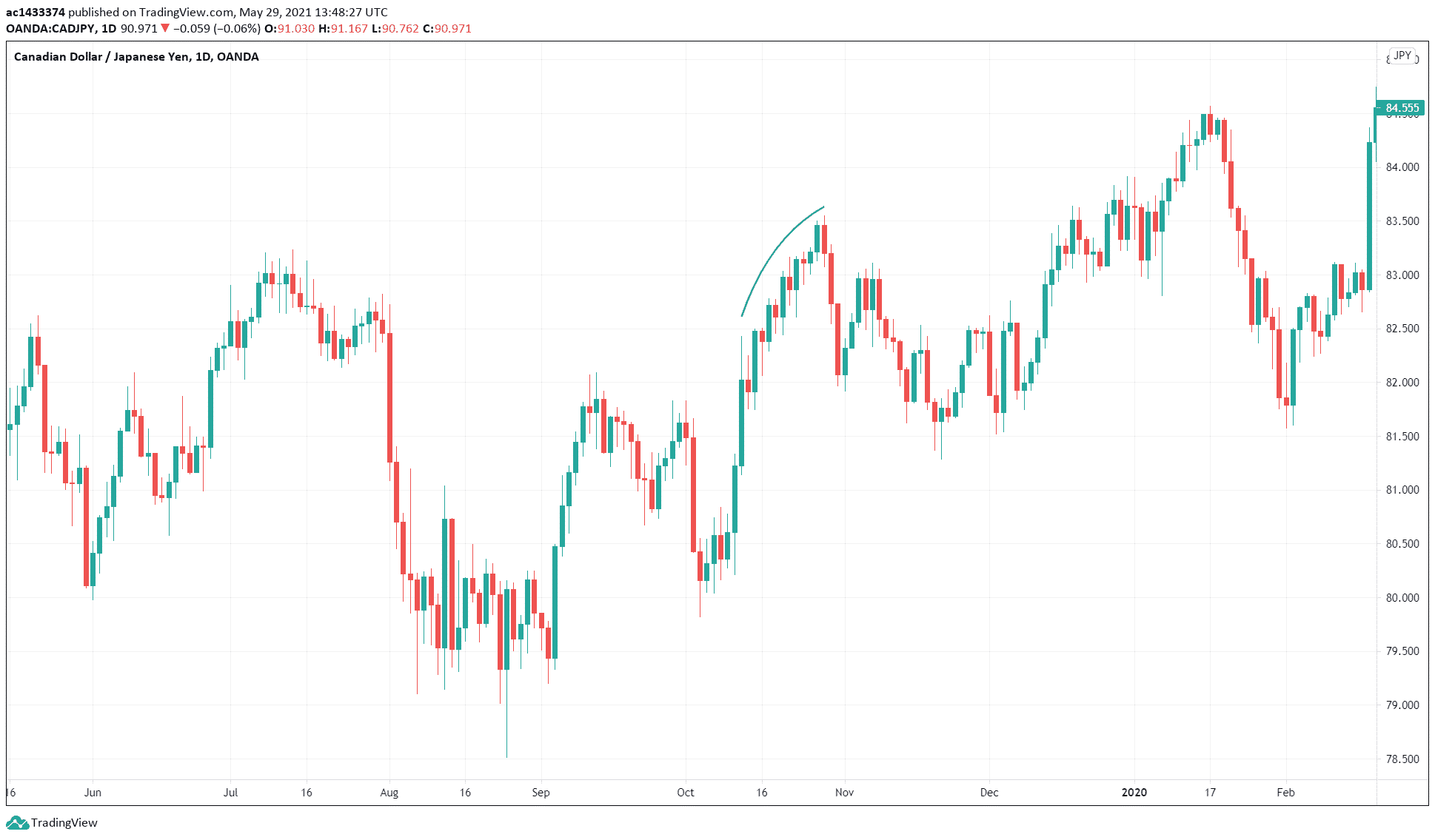
Such is the case in the CAD/JPY daily chart shown above. You can see that the trend was bullish by looking at the swings. There was one occasion where price made a U-turn (refer to the blue arc drawn on the chart) on its way up on the above chart. Price was essentially turning around. At some point, the price eventually went down and made an excellent correction before the uptrend continued.
There are many of these events unfolding in the charts in various timeframes. The challenge with this method of chart analysis is it is subjective, and it would require a lot of screen time before one becomes good at it. Another challenge is the placement of your stop loss if you take trades based on this concept. However, with testing and more analysis, you might find a way to implement this concept in your trading. Consider adding this method to your repertoire.

Clue №2: Change in swing length
Another way to understand the strength of price movement is by analyzing price swings. Traders know that price moves up and down in swings, even in a trend. To determine if the price is losing momentum while in a trend, try to measure the length of swings. You can do the same if the price is correcting and the pullback contains multiple swings.
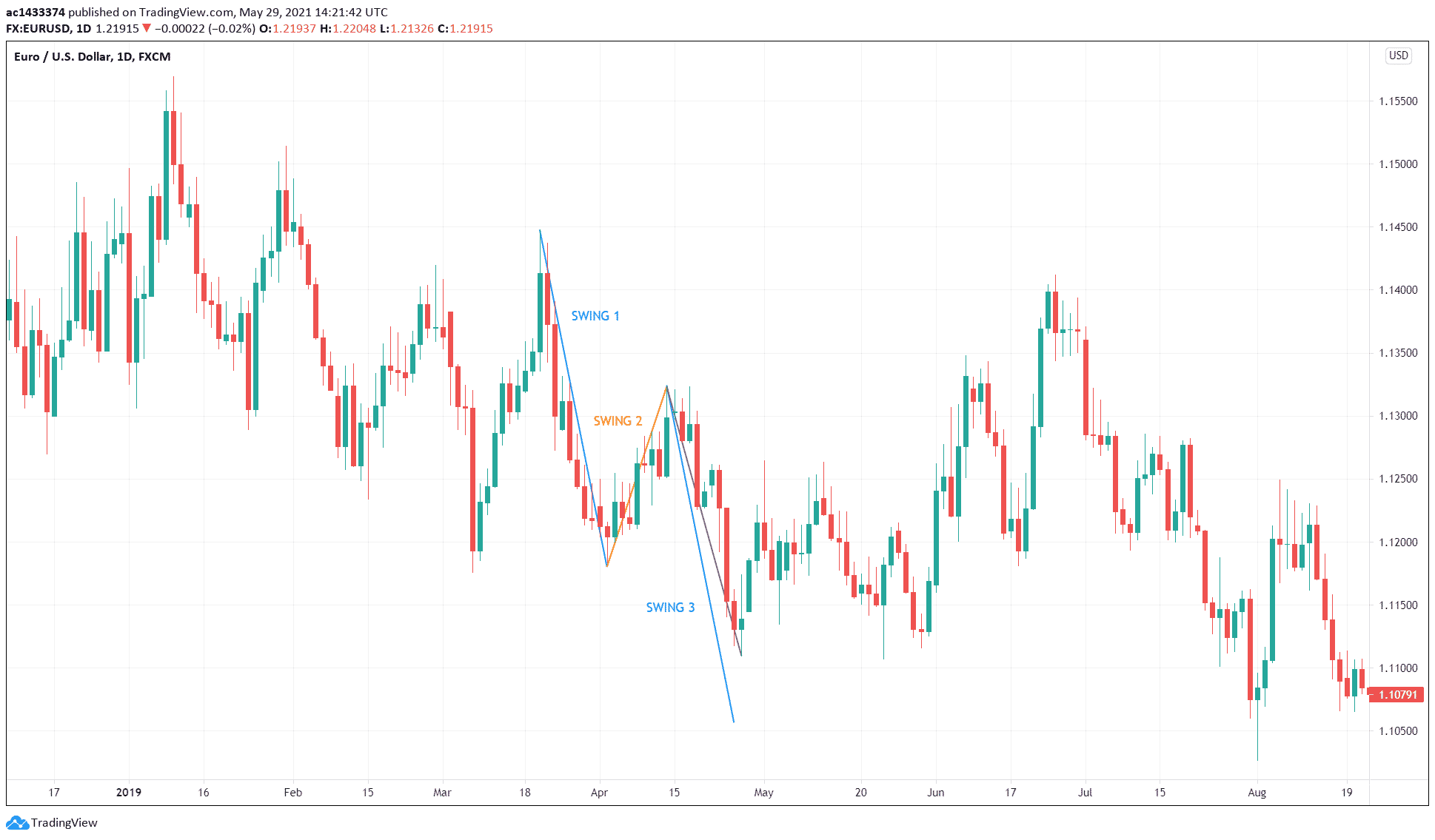
To determine if the price is ready to correct, compare the last two impulse swings. Consider the scenario in the above daily EUR/USD chart. Price is clearly in a downtrend just by looking at price action:
- The price made the corrective swing (swing 2).
- Then it made a lower low (swing 3).
- This swing was shorter than the first impulse swing (swing 1).
- The actual second impulse swing is in violet, while the projected swing 1 is in blue.
While many traders would like to see the second impulse swing to end near the projected swing 1, this does not always happen. If it happens, you are looking at an AB=CD pattern. However, you cannot cast aside the value of the short-second impulse swing as it can show that the price is losing momentum, and a potential reversal might follow. This is exactly what happened in the above chart.
You can expect the price to reverse without completing the AB=CD pattern if a divergence comes into view. Classic divergence often accompanies such reversals.

Clue №3: Change in swing angle
You can also tell if the price is losing momentum if the second impulse swing changes its angle or slope.
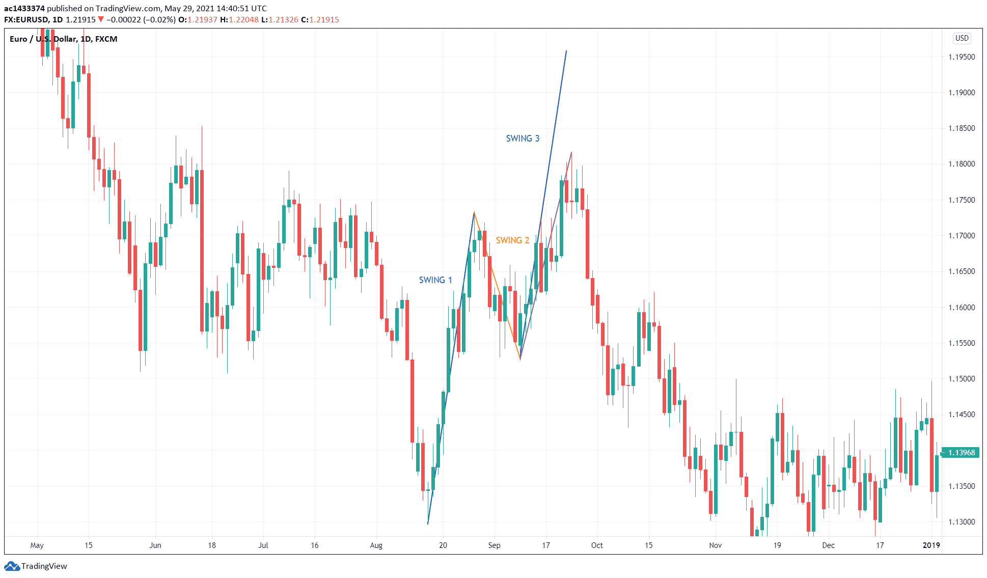
The EUR/USD daily chart above shows that price is correcting an overall downtrend.
- In the process of correction, the price made a complex pullback marked by the three swings.
- The length of the third swing is shorter than the first swing.
- The third swing in blue is the projected first swing, while the third swing in violet is the actual swing.
While the first swing was too steep, the third swing was less steep. This suggests that the third swing is weaker than the first swing. You could make the case that sellers are again coming into the market to take the currency pair down. The change in angle is a signal that the current swing may fail to reach the completion of the AB=CD pattern. After a short consolidation, the price eventually broke down, and the downtrend continued.
Again, divergence often complements this setup, so it is best to trade this setup with an indicator that gives divergence signals, including relative strength index, stochastic, and traders dynamic index, among others.

Combining market exhaustion with support and resistance
As mentioned in previous sections, you can combine divergence to trade the three scenarios that show market exhaustion. Often this combination is enough to enter high-probability trades. However, adding classical support and resistance into the mix is all the more powerful. Thus, the success rate of such trades would be high.
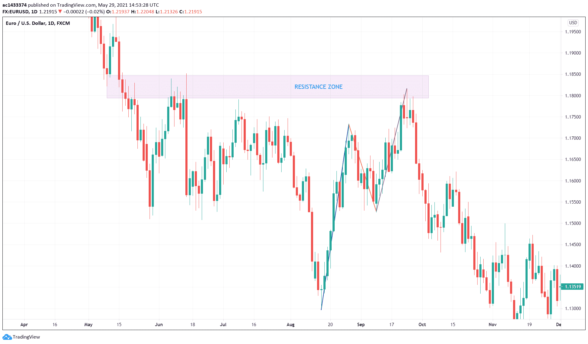
In the above EUR/USD daily chart, we have identified a resistance zone near the third swing of a correction. As already pointed out, the third swing is weaker as characterized by its shorter length and less-steep angle compared to the first swing. Since a resistance area is a place where an ample supply exists, sellers took advantage of the weakness of the correction. As a result, the price broke down, and the downtrend resumed.
Final thoughts
Learning how to read price action is a crucial skill every trader should have. Price action is a broad subject that covers diverse areas for study.
In this article, you have learned one way of reading price action, that is, identifying market exhaustion to discover price reversals. The ideas presented here are compelling and might breathe new life into your trading. Try to contemplate them, find the setups on the charts, and incorporate them into your trading arsenal.


