The analysis of the price itself was born exactly when the chart became available. The first charts were drawn on graph paper, and it was then that the first analysts began to notice areas on the charts in which the price made similar fluctuations at different intervals. These were the first patterns. They began to be called price figures because of the similarity of the first patterns with geometric figures, such as a triangle, rhombus, and square.
In the financial market, price changing occurs by following some common patterns. You may know the textbook quote “history repeats itself,” which is very accurate for the financial market. Smart market participants, such as price action traders, trade and make enormous profits from the market by using these patterns.
However, it requires particular skills to identify those patterns on the candle chart. Learning the functionality of them will take you to another level of understanding. This article will introduce you to the top ten FX patterns you can often see in the chart.
Trading patterns explained
This part includes descriptions of the top ten FX patterns.
1. Head and shoulder
The H&S is a typical pattern that you can find during the price shifting of various financial assets. It has three peaks:
- The left and right tops are the shoulders
- The middle peak counts as a head above shoulders.
Shoulders are lower from the head and at an identical distance.
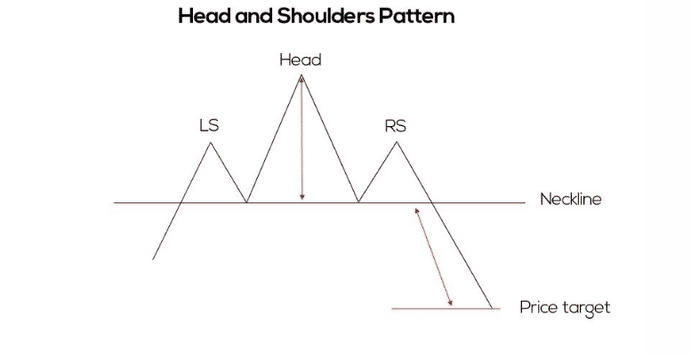
The left shoulder comes first due to a straight bullish movement; then, the price returns and goes up for buyer’s domination. Then the price again comes back to the neckline.
Many believe that this second low should be lower than the first one to symbolize seller domination. However, this pattern acts as a reversal or sometimes also continuation, depending on the participant’s action.
2. Inverse head and shoulder
You may find it just as the turned upside-down of the H&S pattern. You can often find this pattern at the finish of a downtrend. The left shoulder is the first row after a clean price decline; then the price moves up and again creates another low than the first down, that’s the head.
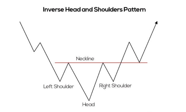
After making the top down or the head, the price retraces back at the neckline and comes back to form the other shoulder. Then generally, the price moves higher than the neckline and continues to go upside after a valid breakout.
3. Double top
It is another typical FX pattern to make trades. This type of pattern has two peaks; both have the same distance with the neckline. After making the first peak by solid price movement, it comes back at the neckline. Then it makes another rise, the same as the first peak, and starts to decline.
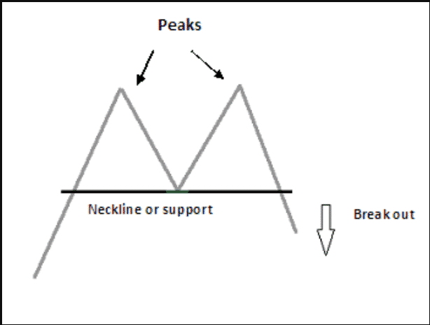
Place sell orders when the price comes below the neckline after making the second peak. Stop loss will be above the high, and exit from trade will be the same distance as the peaks to the neckline.
4. Double bottom
It is an effective pattern that often occurs in price charts, which looks like the inverse form of the double top. You can find this pattern at the end of the declining price movement. It is completed with two lows with a neckline.
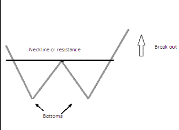
When the price comes back above the neckline after making the second low, place a buy order. Take profit will be the same distance that is between the neckline and two bottoms. Stop loss will be below the last low.
5. Cup and handle
It is another most familiar pattern that occurs during the price movements. It is one of the classic patterns that have two parts: a cup and a handle. The cup of this pattern has a curve like the shape of the capital letter ‘U,’ has a resistance, then comes back to make the handle.
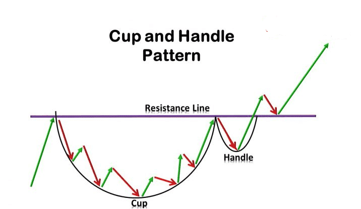
It appears at a bullish price movement; then, it signals a delicate continuation type pattern. When the price moves above the whole pattern or crosses above the resistance mark, it continues to go more upside. This pattern completes when the price breaks above the cup.
6. Inverted cup and handle
You can count the inverted cup and handle pattern as contrary to the “cup and handle.” Whether this pattern you find at a downtrend or an uptrend, price movement always signals bearish pressure on the asset price. You will find this pattern often at the finish line of a bullish trend.
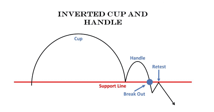
Enter sell order when the price comes below the cup and handle or crosses below the support of the pattern. Take profit will be the same distance below the cup’s size, and stop-loss will be above the handle.
7. Rounding top
It is another effective pattern that appears above the uptrend. The rounding top has a strong uptrend then it creates an inverted ‘U’ shape to the neckline. When the price crosses below the neckline, you can count on this pattern as it completes formation. As a reversal pattern, it gives a sell signal when the price crosses down to the neckline.
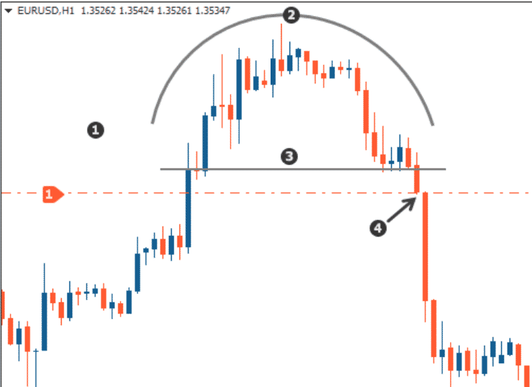
This pattern signals to make sell orders when the price comes below by crossing the neckline. Put stop loss above the recent swing high, and the take-profit level will be the same distance as the pattern formation, which is the same as the top to the neckline.
8. Rounding bottom
This pattern is the opposite of the rounding-top one. You can often find this pattern appears at the end of a downtrend. Price declines and reaches the low of the round, which is usually a ‘U’ shape. This pattern formation completes when the price breaks above the neckline.
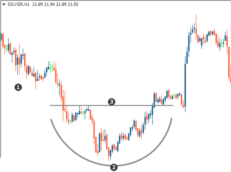
Place a buy order when the price crosses above or breaks the range of the neckline. Your profit target should be the same length as the ‘U’ shape, and stop-loss should be under the neckline.
9. Quasimodo (bullish)
It looks similar to the head and shoulder. You can count the primary difference when the price retraces back at the neckline the last time; after creating the top down or the head, it crosses above the neckline. Moreover, the shoulders can be the same or different heights in this pattern.
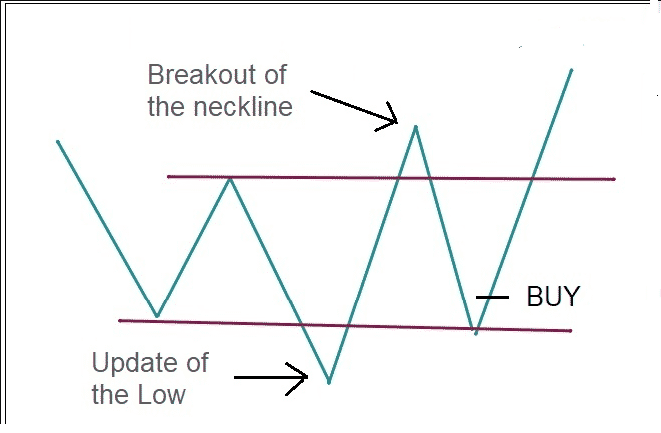
Place a buy order when the third-down occurs, as the figure above shows. The nominal neckline will be the first profit target; the second profit target comes after the breakout that crosses above the neckline. The second profit target will be the same length above, as the neckline and two downs at the right and left side of the top down. Meanwhile, stop loss will be below the last low.
10. Quasimodo (bearish)
It is the opposite of the bullish Quasimodo pattern. When price creates the third peak, that’s the ideal position to take entry through it.
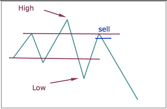
Place sell order at the third peak. Place initial stop loss above the recent high, and the first profit target will be at the neckline. Then if the price breaks below, you can extend your profit target the same distance below the pattern formation.
Final thoughts
These are the topmost standard and effective price action patterns that you can often find in any currency pair chart. We suggest making positions using them after any pattern completes formation and avoiding lower time frame charts such as 1-min, 5-min, 15-min to avoid fake highs and lows.
Currently, more than 100 different patterns have been officially defined and entered into the technical analysis register. New items are found almost every day. If you could find and determine your pattern in the market, do not rush to abandon it because no one wrote about it. Perhaps you have identified a new one that will bring you income.
And the fact that it is known only to you, on the contrary, is a positive aspect since the market maker will not use it to “lure” unwary players. In general, do not be afraid to introduce something new into your trade because the best analyst on the market is you.


