Learning to interpret charts of financial assets is an essential aspect to trade in the financial market. Some patterns are common to the global investors to determine the price movement of trading elements, which allow traders to participate in trading with high profitability and reduce risk. “Inverted cup and handle” is a typical pattern in the world of the financial market.
However, implementation of any trading technique depending on any pattern involves an adequate understanding of that pattern. This article will introduce you to the famous pattern “inverted cup and handle” besides describing various info such as advantages, disadvantages, and trading techniques with chart attachments.
What is the inverted cup and handle pattern?
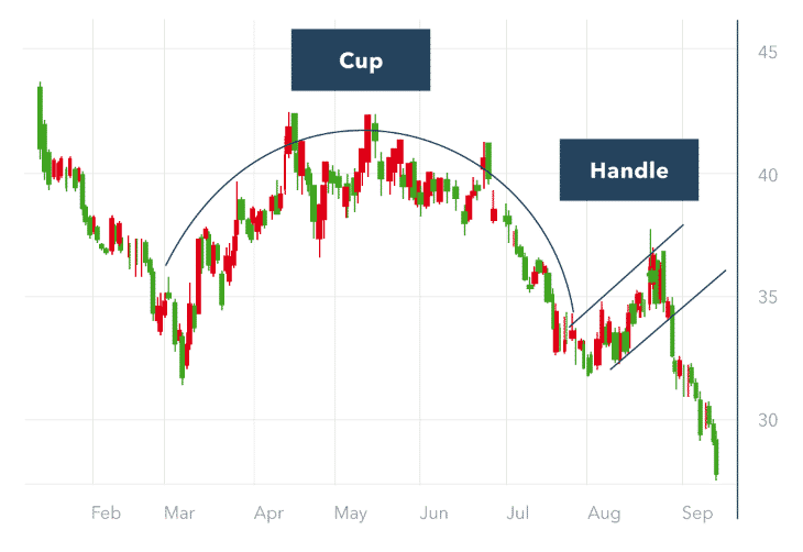
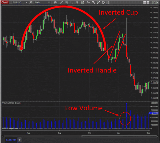
It is one of the critical patterns on various financial asset charts. Its formation requires a certain period to finish its entire appearance. For example, when it appears in a daily chart, it will be no wonder if it takes three to six months to complete the whole shape.

The first part inverted cup and handle formation look like ‘n’ besides having another little handle part. This pattern shape shares similarities with an upside-down teacup. You can define this pattern as a technical pattern that signals any chart’s upcoming declining price movement.
It is contrary to the regular “cup and handle” pattern, which looks like a ‘U’ shape with some extra handle portion. This unique pattern takes place on a support line that can be straight, or a slight slope is acceptable.
How to trade using this pattern
When you want to trade with this effective price pattern, it requires identifying it first. This pattern involves some drawbacks relating to time frames, liquidity of the asset, depth, etc. Following it will enable you to have selling opportunities on the asset as it signals a continuation of the bearish price movement.
The ‘n’ shape inverted cup and handle more potential than an inverted ‘V shape formation. The explanation is simple; the price reaches a level where buyers lose more buying interest on the asset, so the price does not continue to the upside and remain near that level for a certain period. Adding those highs will give you the shape of an upside-down teacup.

Meanwhile, the price reaches back to the support level; break it or not, it will again make another high to create the handle of that cup. That’s the level where traders make sell positions. The first profit target of that sell order is near the support.
You can continue the sell order till any upside pressure comes up, or buyers get back to the asset. Although you can make entry positions easily using this pattern individually, you can use many technical indicators to determine your entry/exit positions.
Trade ideas
This pattern will give you trading ideas depending on the market context. We use MACD, a popular technical indicator, to determine the entry/exit positions or create a complete trading technique. This indicator shows the market context in an independent window with two (red, blue) dynamic lines and histogram bars of different colors on both sides of a central line. Crossover between those two dynamic lines determines buyer/seller domination on the asset price besides histogram bars appearance. You may identify this pattern on any chart, but we suggest using time frames of H4 or above to catch trades with more accuracy.
Bullish trade scenario
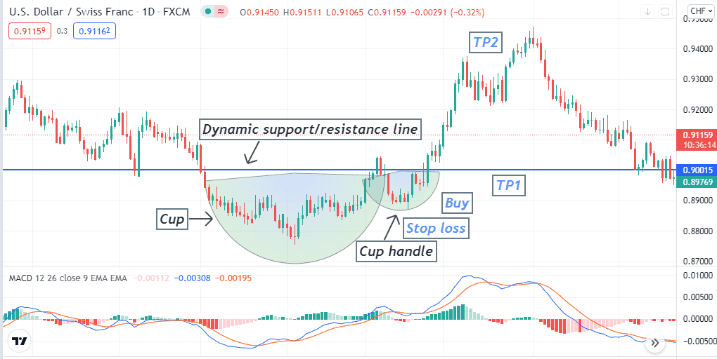
The inverted cup and handle pattern generates trade ideas suggesting selling opportunities. Whereas bullish trade setups, you can find the exact opposite version of this pattern which looks like a teacup. You can use the traditional cup and handle pattern to seek buying opportunities.
Identify the whole cup, then when the price comes back from the resistance line, check the MACD window:
- The dynamic blue line crosses above the dynamic red line.
- Both dynamic lines are above the central (0.0) line head toward the upside.
- MACD green histogram bars take place above the central line.

Entry
When all conditions above match with your target asset chart, place a buy order.
Stop loss
Set an initial stop-loss below the low of the cup handle.
Take profit
The first profit target will be near the resistance line of the cup and handle. If the price breaks above the resistance, wait till:
- The dynamic blue line crosses the dynamic red line on the downside at the MACD window.
- MACD red histogram bars take place below the central line.
Bearish trade scenario
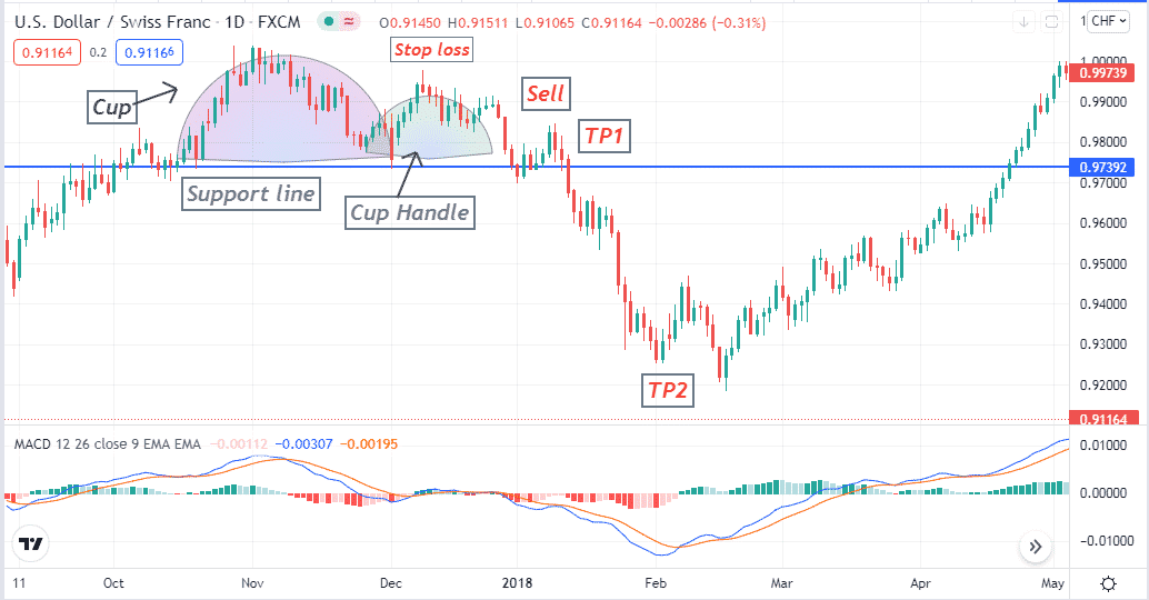
Identify the whole inverted cup, then when the price bounce back from the support line, check the MACD window:
- The dynamic blue line cross below the dynamic red line
- Both dynamic lines are below the central (0.0) line head toward the downside.
- MACD red histogram bars take place below the central line.

Entry
When all conditions above match with your target asset chart, place a sell order.
Stop loss
Set an initial stop-loss below the above of the cup handle.
Take profit
The first profit target will be near the support line of the inverted cup and handle. If the price breaks below the support level, wait till:
- The dynamic blue line crosses the dynamic red line on the upside at the MACD window.
- MACD green histogram bars take place above the central line.
Pros and cons
| Pros | Cons |
| It applies to many financial trading assets. | The formation takes time of this pattern. |
| It suggests trades with excellent risk ratios. | You may not be able to take frequent trading positions using this pattern. |
| You can identify this pattern without any difficulty. | For precious entry/exit positions, you may need to use other technical indicators or tools besides this pattern. |
Final thought
Although it is a very potential pattern, there is no guarantee that it will always work. Mastering this pattern on demo trading is preferable before using it on live trading.


